
Inspired by the Leeds thread what are the worst football badges out there?
I'll start with Aberdeen and Burton Albion:

Results 1 to 30 of 76
Thread: Rubbish Badges
-
24-01-2018 02:26 PM #1Administrator


- Join Date
- Dec 2004
- Age
- 37
- Posts
- 56,068
Rubbish Badges
PM Awards General Poster of The Year 2015, 2016, 2017. Probably robbed in other years
-
24-01-2018 02:33 PM #2Coaching Staff

- Join Date
- Apr 2002
- Posts
- 15,622
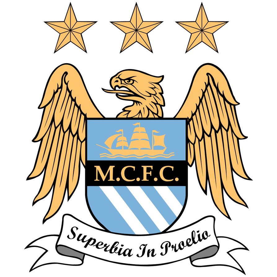
Man City 1997-2016, the 3 stars mean literally nothing, they just saw other clubs had stars so they wanted some.

-
24-01-2018 02:38 PM #3@hibs.net private member

- Join Date
- Apr 2004
- Location
- lincolnshire
- Age
- 64
- Posts
- 24,154
They've had a few good ones down the years but I don't like this Scunny one.
There is however none more embarrassing than Sevco's, displaying all the wee stars that used to belong to the now defunct Glasgow rangers as even those ones didn't officially have the same status as the ones they were hijacking.
"I did not need any persuasion to play for such a great club, the Hibs result is still one of the first I look for"
Sir Matt Busby
-
-
-
24-01-2018 02:58 PM #6First Team Regular
- Join Date
- Dec 2017
- Posts
- 755
I dunno why Berwick felt that a bear/tree hybrid was the way to go.
The two dragons have decidedly unfierce facial features into the bargain.


-
24-01-2018 03:03 PM #7@hibs.net private member

- Join Date
- Apr 2002
- Location
- London
- Age
- 47
- Posts
- 3,345
Killies is a shocker. Partridgesque
KilmarnockLogo.svg.jpg
Bournemouth's looks like a 1980s ladies hair salon or shampoo logo
AFC_Bournemouth_(2013).svg.png
-
24-01-2018 03:05 PM #8Testimonial Due

- Join Date
- May 2007
- Location
- Buskerud
- Posts
- 1,247
I didn't like the old hibs one when it got changed in the 90s. So happy it got changed again!
Last edited by OsloHibs; 24-01-2018 at 06:21 PM.
-
24-01-2018 03:05 PM #9@hibs.net private member

- Join Date
- Apr 2002
- Location
- Essex (the nice bit)
- Age
- 63
- Posts
- 4,534
Yams!
-
24-01-2018 03:08 PM #10First Team Regular
- Join Date
- Dec 2017
- Posts
- 755
Nah. Not only is it actually pretty decent for a club crest (notwithstanding whose crest it is), but it's socially acceptable to spit on it in the middle of the street. Couldn't ask for a better one in that regard! Originally Posted by hibbie02
 This quote is hidden because you are ignoring this member. Show Quote
-
24-01-2018 03:09 PM #11Coaching Staff

- Join Date
- Apr 2005
- Location
- Lexington 125
- Posts
- 6,169
They are not dragons. They are heraldic lions. I am guessing the lion rampant represents Scotland and the lion passant represents England as befits Berwick's border history. Originally Posted by Aim Here
This quote is hidden because you are ignoring this member. Show Quote
The badge is a bit of a dog's dinner -- I will give you that.
-
24-01-2018 03:11 PM #12@hibs.net private member

- Join Date
- Apr 2002
- Location
- Spinning a Yarn
- Posts
- 26,071
Originally Posted by Aim Here
This quote is hidden because you are ignoring this member. Show Quote
The Bear/tree motif is in the burgh coat of arms and the t 'LIONS' represent the torrid history of the burgh changing hands between Scottish (Rampant Lion) and English (Lion passant)There is no such thing as too much yarn, just not enough time.
-
24-01-2018 03:11 PM #13Testimonial Due

- Join Date
- Sep 2012
- Location
- Edinburgh
- Posts
- 1,290
Im guessing the bear symbolises the age old question, Originally Posted by Aim Here
This quote is hidden because you are ignoring this member. Show Quote
Does a bear **** in the woods?
-
24-01-2018 03:13 PM #14@hibs.net private member

- Join Date
- Nov 2012
- Location
- Herefordshire Sassanachland
- Posts
- 4,277
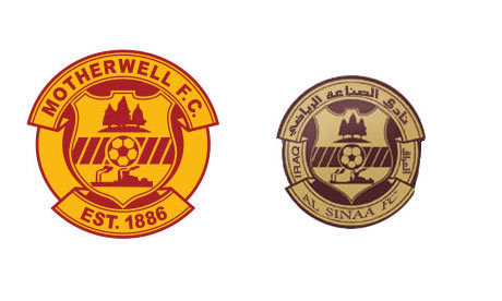
For some reason known only to them Iraqi club Al Sinaa FC decided just to nick Motherwells badge ! They have updated it more recently and now have nicked the Olympic rings !! lol
-
24-01-2018 03:20 PM #15Coaching Staff

- Join Date
- Nov 2002
- Location
- North stand
- Posts
- 17,247
Does this owl really need to be so confrontational?

-
24-01-2018 03:24 PM #16@hibs.net private member

- Join Date
- Aug 2007
- Location
- Tinto Hill
- Age
- 31
- Posts
- 18,424
The bear is wotjek, a bear that polish soldiers brought over to Hilton airfield with them during ww2 Originally Posted by Golden Fleece
This quote is hidden because you are ignoring this member. Show Quote
-
24-01-2018 03:24 PM #17Testimonial Due

- Join Date
- Jul 2007
- Location
- penicuik
- Age
- 43
- Posts
- 1,183
Lincoln City is the worst badge
-
24-01-2018 03:24 PM #18Coaching Staff
- Join Date
- Apr 2005
- Location
- Lexington 125
- Posts
- 6,169
Originally Posted by Tomsk
This quote is hidden because you are ignoring this member. Show Quote
With the aid of Google I found that the bear chained to a tree is an image representing the town of Berwick on Tweed and Berwickshire, being a symbol used on their coats of arms.
You live and learn.
-
24-01-2018 03:27 PM #19First Team Regular

- Join Date
- May 2016
- Posts
- 737
woolfsburg.JPGwoolfsburg2.JPG
Woolfsburgs W badge is just so boring and the one before is just ?
-
24-01-2018 03:28 PM #20Coaching Staff
- Join Date
- Apr 2005
- Location
- Lexington 125
- Posts
- 6,169
It looks severely browned off. Which given Oldham's recent run of good luck should surprise no one. Originally Posted by Pete
This quote is hidden because you are ignoring this member. Show Quote
-
24-01-2018 03:30 PM #21@hibs.net private member
- Join Date
- Nov 2012
- Location
- Herefordshire Sassanachland
- Posts
- 4,277
No it's not Berwick Upon Tweed had a chained bear to a tree as a coat of arms long before the 2nd World War. Originally Posted by Jones28
This quote is hidden because you are ignoring this member. Show Quote
-
24-01-2018 03:32 PM #22@hibs.net private member
- Join Date
- Apr 2004
- Location
- lincolnshire
- Age
- 64
- Posts
- 24,154
What is it with owls and football clubs? Originally Posted by Pete
This quote is hidden because you are ignoring this member. Show Quote
FFS they'll eventually be financing clubs, it's the beginning of the end, especially if the owls are starting to have attitude.
Sent from my SM-J320FN using Tapatalk
"I did not need any persuasion to play for such a great club, the Hibs result is still one of the first I look for"
Sir Matt Busby
-
24-01-2018 03:32 PM #23Administrator
- Join Date
- Dec 2004
- Age
- 37
- Posts
- 56,068
The new one is, believe it or not, an improvement on the old one. Originally Posted by RoslinInstHibby
This quote is hidden because you are ignoring this member. Show QuotePM Awards General Poster of The Year 2015, 2016, 2017. Probably robbed in other years
-
24-01-2018 03:35 PM #24Coaching Staff


- Join Date
- Apr 2012
- Location
- Texas
- Posts
- 12,096
Chill.... it'll be a hoot...... Originally Posted by Bostonhibby
This quote is hidden because you are ignoring this member. Show Quote
-
24-01-2018 03:46 PM #25@hibs.net private member
- Join Date
- Nov 2012
- Location
- Herefordshire Sassanachland
- Posts
- 4,277
Agree I find the three stars absolutely pathetic, this is what their marketing blurb said on launch... Originally Posted by JeMeSouviens
This quote is hidden because you are ignoring this member. Show Quote
"Manchester City Football Club would like to announce that they have commissioned a new crest to replace the round badge that has only existed since 1974. The new club crest is based on elements from the original "Arms of the City of Manchester", the crest which is still used by Manchester City PLC today and worn on the team shirt for all Wembley occasions. It retains the original shield set against an eagle taken from the Badge of the City of Manchester, dating from 1957, also originally found on the City of Manchester Crest, on the ribbon flowing from the knight's helmet. Below the shield is the new club motto "Superbia In Proelio", a Latin phrase translating to "Pride in Battle". The three stars above the eagle constitute a design element that relate a more continental feel to the design.
for "a more continental design" Read "Like a team that has won stuff"
-
24-01-2018 03:47 PM #26Testimonial Due

- Join Date
- Jul 2010
- Location
- Renfrew, Renfrewshire
- Posts
- 1,845
Is Hamburgs badge not the flag of the Port of Hamburg, the most important in Germany? Originally Posted by andybev1
This quote is hidden because you are ignoring this member. Show Quote
Always liked it, even if the huns get on with them.
-
24-01-2018 04:12 PM #27@hibs.net private member
- Join Date
- Aug 2007
- Location
- Tinto Hill
- Age
- 31
- Posts
- 18,424
Oops! My mistake Originally Posted by worcesterhibby
This quote is hidden because you are ignoring this member. Show Quote
-
24-01-2018 04:31 PM #28First Team Regular
- Join Date
- May 2016
- Posts
- 737
I was not aware mate. I suppose if you know the history it makes sense, I just seen the design and was not impressed. Originally Posted by Renfrew_Hibby
This quote is hidden because you are ignoring this member. Show Quote
EDIT: I just checked and the port of Hamburg have a castle with an anchor on their flag but there is an article saying that the badge is a nod to its maritime tradition.
I actually meant to put the Napoli badge up which is just an N also.Last edited by andybev1; 24-01-2018 at 04:43 PM.
-
24-01-2018 04:34 PM #29@hibs.net private member
- Join Date
- Nov 2012
- Location
- Herefordshire Sassanachland
- Posts
- 4,277
No worries Originally Posted by Jones28
This quote is hidden because you are ignoring this member. Show Quote
-
24-01-2018 05:01 PM #30First Team Breakthrough

- Join Date
- Mar 2012
- Posts
- 400
Irritable Owl Syndrome Originally Posted by Tomsk
This quote is hidden because you are ignoring this member. Show Quote

 Reply With Quote
| Log in to remove the advert |


Bookmarks